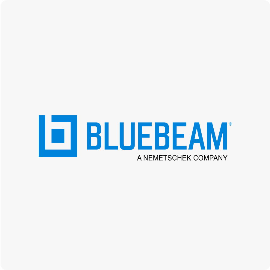
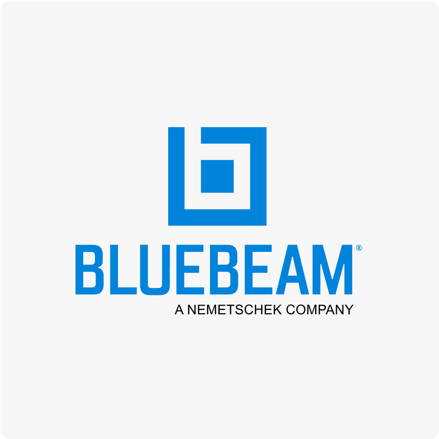


Our logo has two different lockups designed to work in a variety of placements.
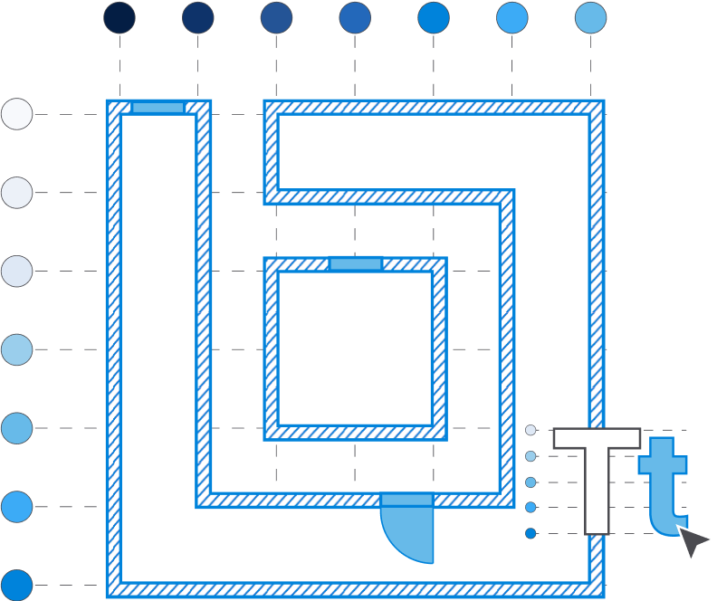
The minimum clearance around the logo is the width of the B symbol in the logo.
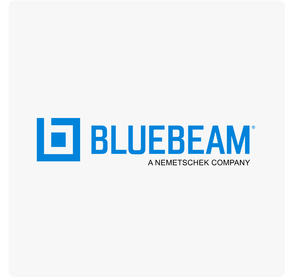
Our primary logo is the blue logo on a white background. Please consider what color background you will be placing your logo on.
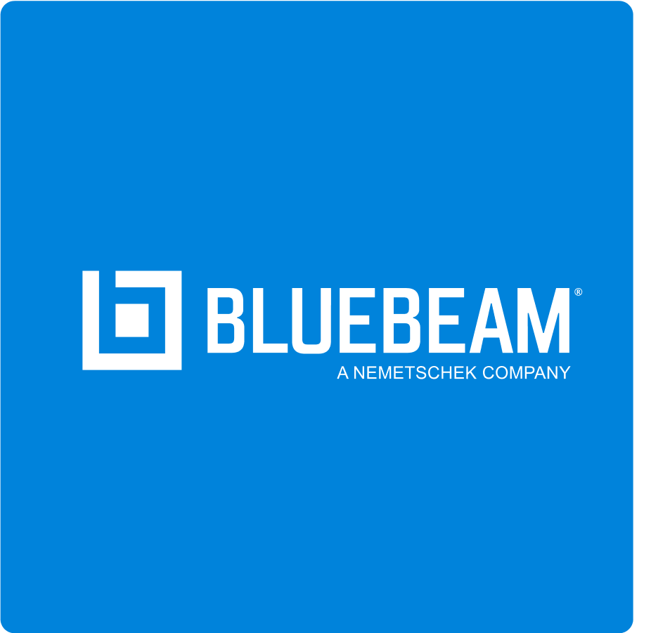
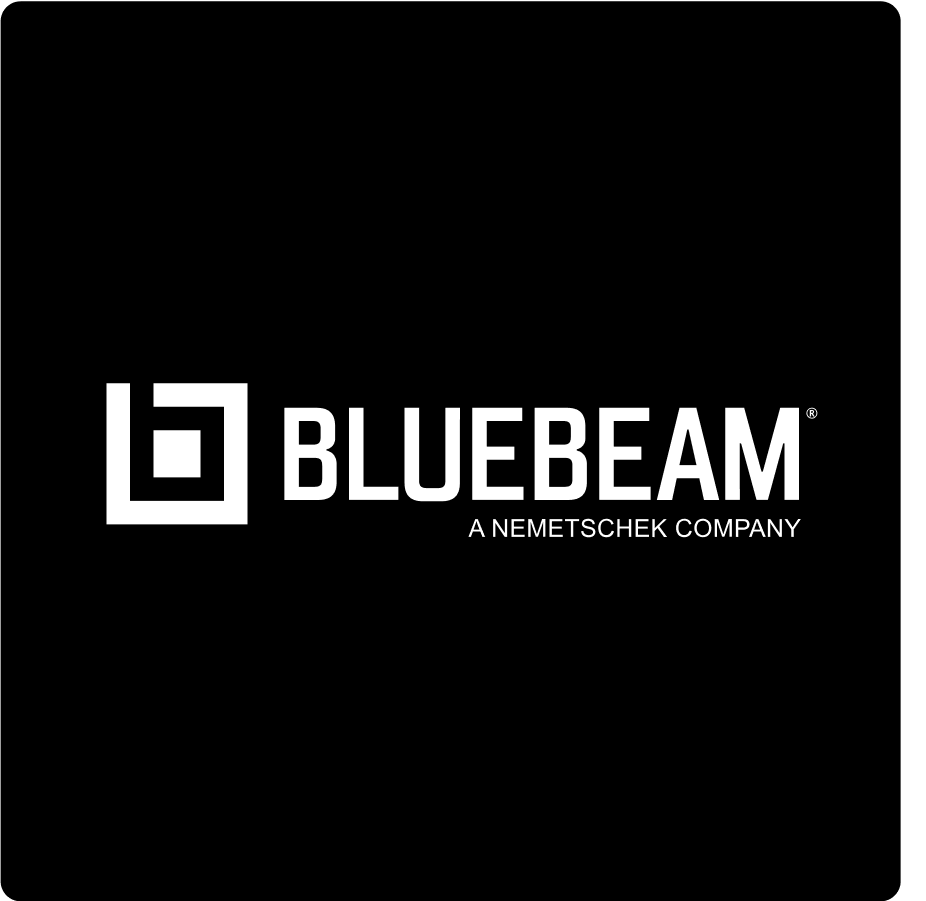
If using the logo on a dark background, use the white logo.
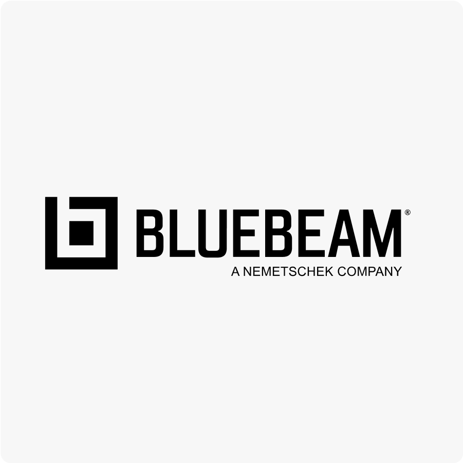
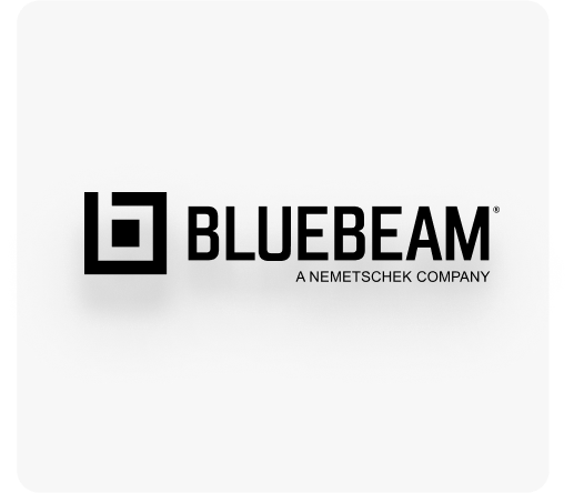
If using the logo on a light background, use the blue or black logo.
Higher contrast between the logo and the background allows for better readability.
Avoid changing the colors of the logo.
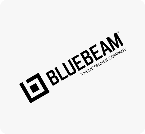
Avoid rotating the logo.
Avoid stretching or compressing the logo.
Avoid adding extra effects to the logo.
Avoid recreating the logo.
Avoid making alterations and additions to the logo.
Please do not: